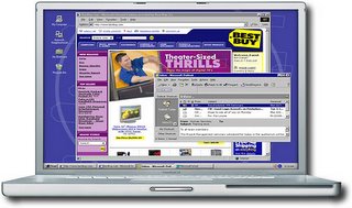
 I love it when my students get creative about spotting errors for the "Copy Edit the World" assignment. For example, take a close look at this graphic sent to me by photojournalist and fellow blogger Daniel Sato from my 61A class.
As a writer, I tend to think in terms of typos and AP style errors for this assignment, but, as Sato notes, "designers must also keep a sharp eye out for errors as well!" As evidence, he sent this graphic which seems to show Windows 98 running on a (pre-Intel) Mac.
Looks like somebody went a little Photoshop-happy on this one...and nobody caught it before it went out the door.
Reminds me of a livestock insurance ad I once worked on. The illustration showed a rider on a hunter-jumper (that's a type of horse, for you non-equine-oriented folks) clearing a fence...but the saddle had no girth. Any horse-savvy potential client would have noticed that omission right away, and our client would have lost all credibility. Good thing I caught it first.
No comments:
Post a Comment